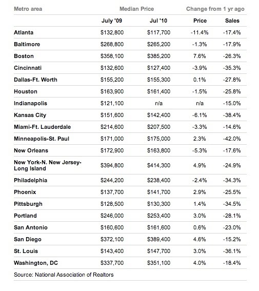
This information graphic appeared on the USA Today website on Aug. 25, accompanying a story on the decline of home sales. While it doesn’t specify who created the table, it tells readers that the source of the information is the National Association of Realtors. The website also says to contact Standards Editor Brent Jones for corrections or clarifications.
The strength of this information graphic lies in its simplicity. Readers can easily understand the information because numbers are labeled and aligned neatly. The lack of artistic design and visual appeal in the graphic might be considered a weakness. But the lack of visual gimmicks makes the graphic easier to read and understand.
The graphic shows how much home prices have dropped in the last year in major cities across the country. It also shows the drop in home sales over the last year in those major cities. The graphic contains a lot of information, but it is easily understood because of the organization.
Organizing the cities differently would enhance this graphic. Wurman mentions different ways of organizing information graphics in his article: location, alphabet, time, category and hierarchy. The designer of this graphic listed the cities in alphabetical order, but that would have been one of my last choices. The designer could have grouped cities based on location, so readers could compare cities in their region. The graphic could have organized the cities based on category by grouping cities whose home sale prices have dropped 0-2% and those that have dropped 2-4%, etc. The graphic also could have grouped the cities based on hierarchy, listing them from highest to lowest in terms of price drops over the last year. All these different organizations would allow readers to better compare the information.
Any readers interested in the economy or trying to buy or sell a home will look at this graphic when they come across it. While the graphic is not visually stunning, it presents such a wealth of information in such an understandable way that any average reader will spend a minute or two learning about the drop in home sales.
Because this information graphic is simple and easy to understand, it is an effective design. It would be even more effective with a little different organization, but it still explains the information sufficiently. This graphic is a great example of how the news and information (the narrative) should be the driving focus of a graphic rather than the visual gimmicks that are the focus of so many designers.
No comments:
Post a Comment